This widget is really simple, but more powerfull and fully customized button. Touch, long-touch and long-long-touch supported, also simple-btn can send data customized by user. Support all 500 Ionic icons (left, right and center positions). You can use Ionic color classes or standart HTML hexadecimal color codes. Usefull for control any devices from relays to cars and robots.
        <div style="style1" class="class1">
            <div style="style2" class="class2">
               descr
             </div>
            <button style="style3" class="class3">
               title
            </button>
        </div>
This widget can accept status data. Send any attributes from config for “reconfigure” this widget.
Try send, for example status message: { "style" : "display:none;" } or { "widgetConfig" : '{ "title": "New title" }' }
class3 - string, required, always contains button class and can contains other Ionic button-specific classes.
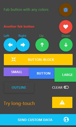
class3 can contains next classes: button-fab, button-rised, button-block, button-small, button-large, button-outline, button-clear. See screenshoot at above for details. For example, class3: "button button-block"
class3 also, can contains Ionic color classes with button- prefix, for example, class3: "button button-large button-royal"
And, finally, class3 can contains class for icon from all 500 Ionic icons and class for icon position: icon (for center position), icon-left and icon-right, for example class3:"button button-calm button-block icon-right ion-earth"
widgetConfig - JSON string, optional and may be empty JSON object {}, with simple-btn specific parameters:
title - string, optional, always will be capitalized, for example My button see as MY BUTTON
fill - string, optional, but recommended if class3 not contains color class, background color for button in normal state (HTML hex color code), for examples: #52FF00 - green, #F10014 - red, #58b7ff - blue, #FFE800 - yellow
fillPressed - string, optional, but recommended if class3 not contains color class, background color for button in pressed state (HTML hex color code), for examples: #52FF00 - green, #F10014 - red, #58b7ff - blue, #FFE800 - yellow
label - string, optional, but recommended if class3 not contains color class, color for title in normal state (HTML hex color code), for examples: #52FF00 - green, #F10014 - red, #58b7ff - blue, #FFE800 - yellow
labelPressed - string, optional, but recommended if class3 not contains color class, color for title in pressed state (HTML hex color code), for examples: #52FF00 - green, #F10014 - red, #58b7ff - blue, #FFE800 - yellow
delay - integer, optional, can equal zero or from 50 to 5000. Its time in millisecons for repeatly sending data to device when button is pressed. If delay eq zero or absent, then data will be send to device once after button touch. If delay, for example, equal 200, then data will be send to device every 200ms while button is pressed. Please, do not use value less 200, if you have slow broker or poor internet connection.
For example, if delay:500 and button in pressed state 2sec, then IoT Manager send to device 4 messages.
For example, if delay:100 and button in pressed state 1sec, then IoT Manager send to device 10 messages.
data - any type, optional, if exist, this value will be send to device “as is”, otherwise 1
disabled - string, optional, if == 1, button will not send any data to device. Use { "disabled" : "0" } for enabling again.
Also, simple-btn widget support confirmation dialog:
alertText - string, optional, example: alertText="A you sure?" confirmation will be show after button pressed
alertTitle - string, optional. Title for confirmation dialog.
id - integer, required widget id (must be unique on device, also used for widget sorting on page), use numeric value for widgets sorting on dashboard pages
pageId - integer, optional (needed only when you planing use widgets on several pages), always > 0 (0 - for system page “All”) value for page ID (used for pages sorting), for example 1 or 70. Beter way: use 10, 20, 30, for easy new page inserting in future.
page - string, optional (needed only when you planing use widgets on several pages) value for page name (widgets group name), for example kitchen. Page name always capitalized by IoT Manager.
class1 - string, optional HTML classes list div element. You can use Color classes, Padding classes, Other usefull classes and Bootstrap3 col-xs and col-xm grids classes, for example item no-border
style1 - string, optional HTML style for div elements (you can use any HTML5 styles), for example padding-top:5px;padding-bottom:10px; (descrStyle for ON state and descrStyleOff for OFF state)
class2 - string, optional HTML classes list for second level div element descr (you can use Color classes, Padding classes, Other usefull classes and Bootstrap3 col-xs and col-xm grids classes), for example assertive text-center
style2 - string, optional HTML style for second level div element descr (you can use any HTML5 styles), for example font-size:20px;font-weight:bold;
class3 - string, optional HTML classes list for 3rd level div element (you can use Color classes, Padding classes, Other usefull classes and Bootstrap3 col-xs and col-xm grids classes), for example text-center
style3 - string, optional HTML style for 3rd level div element (you can use any HTML5 styles), for example padding-top:5px;padding-bottom:5px;
topic - string, required broker topic for this widget (must be unique at the project, and must contains unique device name), for example /IoTmanager/device01/sensor01.
Widget get status value from subcribed topic /IoTmanager/device01/sensor01/status for displaying value in widget, received status must be a JSON string {status:100}
You can show/hide any widget: send widget-config JSON contains only widget id for widget hiding (for example, { "id":"5" }) and full config for showing.
user - string, optional. If this field exist, then IoT Manager compare broker username and user field. If equal, message passed, else skipped.
users - string, optional. Userlist separate by space. If this field exist, then IoT Manager check for broker username contains in users field. If yes, message passed, else skipped.
This feature not for security reason. For users ACL, please, use brokers feature (grant access to topics by username).
uuid - string, optional. If exist, this config message will be parced only on device with specified UUID.
minWidth - integer, optional. If exist, message parser compare device width and minWidth fiels. If device_width >= minWidth then config message passed, else skipped.
maxWidth - integer, optional. If exist, message parser compare device width and maxWidth fiels. If device_width <= maxWidth then config message passed, else skipped.
Usally, status message contains wedget value only, for example { status: 50 } or { status: "50" }.
But, in several cases, you can want to add some extra features:
vibrate - execute action vibrate when message received, for example { status: 50, vibrate: 100 }, where 100 - vibration time in milliseconds.
toast - execute action toast when message received, for example { status: 50, toast: "Alert!" }, where Alert! - showing message.
toastLong - execute action toastLong when message received, for example { status: 50, toastLong: "Alert!" }, where Alert! - showing message.
beep - execute action beep when message received, for example { status: 50, beep: 1 }, where 1 - beeper counter.
speech - speech text, for example { status: 50, speech: 'hello' } or try { status: 50, speech: '50' }.
rate - float, from 0 to 1 speech rate, for example { status: 50, speech: 'hello', rate: 0.7 }. Default rate 1.
locale - string, speech locale, for example { status: 50, speech: 'hello', rate: 0.7, locale: 'fr-FR' }. Default locale en-US.
 {
        id     : "0",
        page   : "buttons",
        pageId : 1,
        widget : "simple-btn",
        class1 : "item no-border no-padding-bottom",
        descr  : "Fab button with any colors",
        class2 : "balanced padding-top",
        style2 : "float:left;font-size:16px;",
        topic  : prefix + "/" + deviceID + "/simple-btn0",
        class3 : "button button-fab icon ion-bug",
        style3 : "float:right;",
            widgetConfig : {
                fill         : "#724200", // any HTML colors
                fillPressed  : "#004333",
                label        : "#4990E2",
                labelPressed : "#FF0000"
             }
 }
{
        id     : "4",
        page   : "buttons",
        pageId : 1,
        widget : "simple-btn",
        class1 : "col-xs-3 text-center",
        descr  : "Up",
        class2 : "balanced",
        topic  : prefix + "/" + deviceID + "/simple-btn4",
        class3 : "button button-balanced button-fab icon ion-arrow-up-c"
}
{
  id     : "6",
  page   : "boiler",
  pageId : 1,
  widget : "simple-btn",
  topic  : prefix + "/" + deviceID + "/" + widget + id,
  class1 : "item no-border padding-bottom",
  descr  : "Emergency Stop heating",
  class2 : "assertive padding-top",
  style2 : "float:left;",
  class3 : "button icon ion-checkmark-circled",
  style3 : "float:right;",
  widgetConfig : {
    fill : "#FF5050",
    fillPressed : "#FF7070",
    label: "#FFFFFF",
    labelPressed: "#000000",
    alertText     : "A you sure?", // confirmation will be show after button pressed
    alertTitle    : "Stop heating",
  }
}
Demo sketches for Arduino IDE, Platformio, NodeJS, python, bash
 IoT Manager