This widget fully customized for managing ANY switched devices.
        <div class="class1" style="style1">
            <div class="item-toggle descrClass" style="descrStyle">
               <i class="iconClass" style="iconStyle">descr</i>
               <label class="toggle">
                  <input type="checkbox" />
                  <div class="track" style="trackStyle">
                     <div class="handle" style="handleStyle"></div>
                  </div>
               </label>
            </div>
        </div>
class1, descrClass - string, optional HTML classes list div elements (you can use Color classes, Padding classes, Other usefull classes and Bootstrap3 col-xs and col-xm grids classes), for example item no-border
style1, descrStyle, descrStyleOff - string, optional HTML style for div elements (you can use any HTML5 styles), for example padding-top:5px;padding-bottom:10px; (descrStyle for ON state and descrStyleOff for OFF state)
iconClass, iconClassOff - string, optional HTML classes for icon (you can use Ionic icons, (iconClass for ON state and iconClassOff for OFF state) for example ion-checkmark-circled
iconStyle, iconStyleOff - string, optional HTML style for icon (you can use any HTML5 styles), for example font-size:40px; (two classes for ON and OFF states)
trackStyle, handleStyle, trackStyleOff, handleStyleOff - string, optional HTML style for toggle elements (you can use any HTML5 styles), for example background-color:#FFF;, see Color classes
This widget can accept status data. Send any attributes from config for “reconfigure” this widget.
Try send, for example status message:{ "descrStyle" : "display:none;" } or{ "descrClass" : "calm-bg light-900" }
This widget display descr and status if exist. Status value must be 1 or 0.
id - integer, required widget id (must be unique on device, also used for widget sorting on page), use numeric value for widgets sorting on dashboard pages
page - string, optional value for page name (widgets group name), for example kitchen
pageId - integer, optional, always > 0 (0 - for system page “All”) value for page ID (used for pages sorting), for example 1 or 7
topic - string, required broker topic for this widget (must be unique at the project, and must contains unique device name), for example/IoTmanager/device01/sensor01.
Widget getstatus value from subcribed topic/IoTmanager/device01/sensor01/status for displaying value in widget, received status must be a JSON string {status:1}
You can show/hide any widget: send widget-config JSON contains only widgetid for widget hiding (for example,{ "id":"5" }) and full config for showing.
user - string, optional. If this field exist, then IoT Manager compare broker username and user field. If equal, message passed, else skipped.
users - string, optional. Userlist separate by space. If this field exist, then IoT Manager check for broker username contains in users field. If yes, message passed, else skipped.
This feature not for security reason. For users ACL, please, use brokers feature (grant access to topics by username).
uuid - string, optional. If exist, this config message will be parced only on device with specified UUID.
minWidth - integer, optional. If exist, message parser compare device width and minWidth fiels. If device_width >= minWidth then config message passed, else skipped.
maxWidth - integer, optional. If exist, message parser compare device width and maxWidth fiels. If device_width <= maxWidth then config message passed, else skipped.
Usally, status message contains wedget value only, for example { status: 50 } or { status: "50" }.
But, in several cases, you can want to add some extra features:
vibrate - execute action vibrate when message received, for example { status: 50, vibrate: 100 }, where 100 - vibration time in milliseconds.
toast - execute action toast when message received, for example { status: 50, toast: "Alert!" }, where Alert! - showing message.
toastLong - execute action toastLong when message received, for example { status: 50, toastLong: "Alert!" }, where Alert! - showing message.
beep - execute action beep when message received, for example { status: 50, beep: 1 }, where 1 - beeper counter.
speech - speech text, for example { status: 50, speech: 'hello' } or try { status: 50, speech: '50' }.
rate - float, from 0 to 1 speech rate, for example { status: 50, speech: 'hello', rate: 0.7 }. Default rate 1.
locale - string, speech locale, for example { status: 50, speech: 'hello', rate: 0.7, locale: 'fr-FR' }. Default locale en-US.
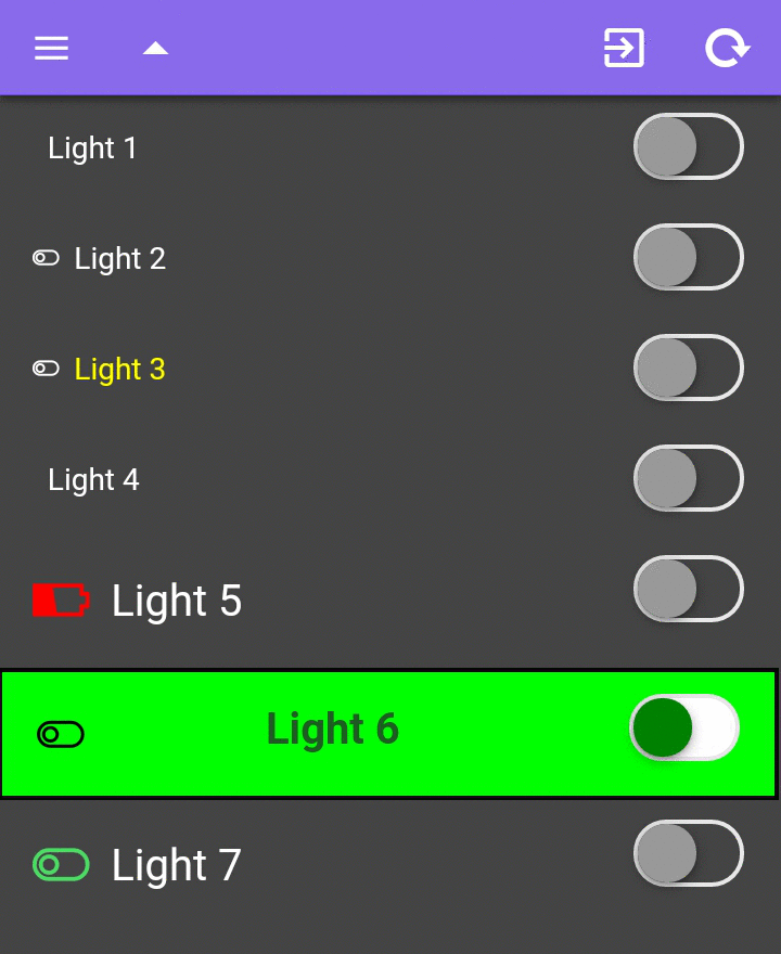
{
        id     : 1,
        widget : "toggle",
        descr  : "Light 1",
        topic  : prefix + "/" + deviceID + "/light1"
}
{
        id     : "2",
        descr  : "Light 2",
        widget : "toggle",
        topic  : prefix + "/" + deviceID + "/light2",
        color  : "orange" // any HTML color code
}
{
        id     : "3",
        descr  : "Light 3",
        widget : "toggle",
        topic  : prefix + "/" + deviceID + "/light3",
        color  : "#00FF00",
        descrStyle : "color:#FFFF00"
}
{
        id        : "4",
        descr     : "Light 4",
        widget    : "toggle",
        topic     : prefix+ "/" + deviceID + "/light4",
        color     : "blue", // any HTML color code
        iconStyle : "display:none;"
}
{
        id           : "5",
        descr        : "Light 5",
        widget       : "toggle",
        topic        : prefix + "/" + deviceID + "/light5",
        iconClass    : "ion-battery-charging",
        iconClassOff : "ion-battery-low",
        iconStyle    : "font-size:30px;color:#4cd964;",
        iconStyleOff : "font-size:30px;color:red;",
        descrStyle   : "font-size:20px;line-height:1.5em;"
}
{
        id             : "6",
        descr          : "Light 6",
        widget         : "toggle",
        topic          : prefix + "/" + deviceID + "/light6",
        descrClass     : "balanced-900 text-center",
        descrStyle     : "background-color:#0F0;border:solid 2px #F00;font-size:20px;font-weight:bold;",
        descrStyleOff  : "background-color:#0F0;border:solid 2px #000;font-size:20px;font-weight:bold;",
        iconStyle      : "color:red;font-size:25px;",
        iconStyleOff   : "color:black;font-size:25px;",
        trackStyle     : "background-color:red;",
        trackStyleOff  : "background-color:white;",
        handleStyle    : "background-color:yellow;",
        handleStyleOff : "background-color:green;"
}
 IoT Manager