This is very powerfull widget based on SteelSeries canvas library
steel widgets have several types: Linear, LinearBargraph, LightBulb, Battery, Led and Odometer (other widget types coming soon)
<div class="class1" style="style1">
  <canvas width="width" height="height"></canvas>
</div>
width - numeric, width in pixels (without px), auto - for fullwidth or auto2 - for half width, for example, width:300 or width:"auto"
height - numeric, height in pixels (without px), for example height:100
type - string, type of steel widget. Can be: Linear, LinearBargraph, LightBulb, Battery and Led (other widget types coming soon)
This types of steel widget accept any numeric status data. For example 4656.427.
useValueGradient - boolean, only for LinearBargraph type of widget
titleString - string, widget title, for example Thermometer 1
unitString - string, unit string, for example Celsius
threshold - numeric, threshold value, for example 50
thresholdVisible - boolean
thresholdRising - boolean
FrameDesign - string, may be: BLACK_METAL METAL SHINY_METAL BRASS STEEL CHROME GOLD ANTHRACITE TILTED_GRAY TILTED_BLACK GLOSSY_METAL
BackgroundColor - string, may be: DARK_GRAY SATIN_GRAY LIGHT_GRAY WHITE BLACK BEIGE BROWN RED GREEN BLUE ANTHRACITE MUD PUNCHED_SHEET CARBON STAINLESS BRUSHED_METAL BRUSHED_STAINLESS TURNED
backgroundVisible - boolean
ColorDef - string, (its not HTML5 color code!) may be: RED GREEN BLUE ORANGE YELLOW CYAN MAGENTA WHITE GRAY BLACK RAITH GREEN_LCD JUG_GREEN
LcdColor - string, (its not HTML5 color code!) may be: BEIGE BLUE ORANGE RED YELLOW WHITE GRAY BLACK GREEN BLUE2 BLUE_BLACK BLUE_DARKBLUE BLUE_GRAY STANDARD STANDARD_GREEN BLUE_BLUE RED_DARKRED DARKBLUE LILA BLACKRED DARKGREEN AMBER LIGHTBLUE SECTIONS
lcdVisible - boolean, view or hide lcd element
lcdDecimals - numeric
LedColor - string, (its not HTML5 color code!) may be: RED_LED GREEN_LED BLUE_LED ORANGE_LED YELLOW_LED CYAN_LED MAGENTA_LED
ledVisible - boolean
frameVisible - boolean
minMeasuredValueVisible - boolean
maxMeasuredValueVisible - boolean
minValue - numeric
maxValue - numeric
niceScale - boolean
This types of steel widget accept numeric status data from 0 to 100. For example 75
glowColor - string, HTML5 color, Red color for example: rgb(204, 51, 0)
This types of steel widget accept numeric status data from 0 to 100. For example 75
Steel Battery has only width and height parameters.
This types of steel widget accept numeric status data, 0 or 1.
For example, 1
LedColor - string, (its not HTML5 color code!) may be: RED_LED GREEN_LED BLUE_LED ORANGE_LED YELLOW_LED CYAN_LED MAGENTA_LED
blink - boolean, if true, then led blinking (1Hz)
This types of steel widget accept numeric status data. For example 123.5
Odometr has only width and height parameters.
id - integer, required widget id (must be unique on device, also used for widget sorting on page), use numeric value for widgets sorting on dashboard pages
pageId - integer, optional (needed only when you planing use widgets on several pages), always > 0 (0 - for system page “All”) value for page ID (used for pages sorting), for example 1 or 70. Beter way: use 10, 20, 30, for easy new page inserting in future.
page - string, optional (needed only when you planing use widgets on several pages) value for page name (widgets group name), for example kitchen. Page name always capitalized by IoT Manager.
class1 - string, optional HTML classes list div element. You can use Color classes, Padding classes, Other usefull classes and Bootstrap3 col-xs and col-xm grids classes, for example item no-border
style1 - string, optional HTML style for div elements (you can use any HTML5 styles), for example padding-top:5px;padding-bottom:10px; (descrStyle for ON state and descrStyleOff for OFF state)
topic - string, required broker topic for this widget (must be unique at the project, and must contains unique device name), for example /IoTmanager/device01/sensor01.
Widget get status value from subcribed topic /IoTmanager/device01/sensor01/status for displaying value in widget, received status must be a JSON string.
user - string, optional. If this field exist, then IoT Manager compare broker username and user field. If equal, message passed, else skipped.
users - string, optional. Userlist separate by space. If this field exist, then IoT Manager check for broker username contains in users field. If yes, message passed, else skipped.
This feature not for security reason. For users ACL, please, use brokers feature (grant access to topics by username).
uuid - string, optional. If exist, this config message will be parced only on device with specified UUID.
minWidth - integer, optional. If exist, message parser compare device width and minWidth fiels. If device_width >= minWidth then config message passed, else skipped.
maxWidth - integer, optional. If exist, message parser compare device width and maxWidth fiels. If device_width <= maxWidth then config message passed, else skipped.
Usally, status message contains wedget value only, for example { status: 50 } or { status: "50" }.
But, in several cases, you can want to add some extra features:
vibrate - execute action vibrate when message received, for example { status: 50, vibrate: 100 }, where 100 - vibration time in milliseconds.
toast - execute action toast when message received, for example { status: 50, toast: "Alert!" }, where Alert! - showing message.
toastLong - execute action toastLong when message received, for example { status: 50, toastLong: "Alert!" }, where Alert! - showing message.
beep - execute action beep when message received, for example { status: 50, beep: 1 }, where 1 - beeper counter.
speech - speech text, for example { status: 50, speech: 'hello' } or try { status: 50, speech: '50' }.
rate - float, from 0 to 1 speech rate, for example { status: 50, speech: 'hello', rate: 0.7 }. Default rate 1.
locale - string, speech locale, for example { status: 50, speech: 'hello', rate: 0.7, locale: 'fr-FR' }. Default locale en-US.
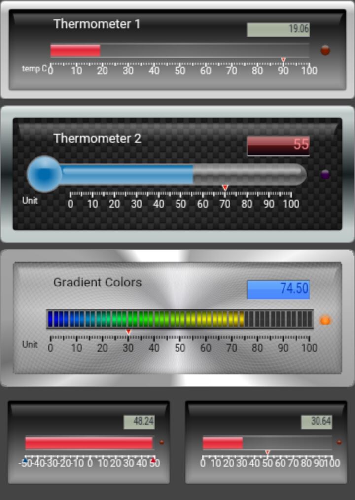
{
id     :"1",
descr  :"Steel 1",
widget :"steel",
topic  :prefix + "/" + deviceID + "/steel1",
widgetConfig : {
  width  : "auto",
  height : 100,
  type   : "Linear",
  titleString: "Thermometer 1",
  unitString : "temp C",
  threshold: 90
}
{id     :"2",
descr  : "Steel 2",
widget : "steel",
topic  : prefix + "/" + deviceID + "/steel2",
widgetConfig : {
  width       : "auto",
  height      : 140,
  type        : "Linear",
  gaugeType   : "TYPE2",
  titleString : "Thermometer 2",
  unitString  : "Unit",
  threshold   : 70,
  lcdVisible  : true,
  lcdDecimals : 0,
  FrameDesign : "STEEL",       // BLACK_METAL METAL SHINY_METAL BRASS STEEL CHROME GOLD ANTHRACITE TILTED_GRAY TILTED_BLACK GLOSSY_METAL
  BackgroundColor: "CARBON",   // DARK_GRAY SATIN_GRAY LIGHT_GRAY WHITE BLACK BEIGE BROWN RED GREEN BLUE ANTHRACITE MUD PUNCHED_SHEET CARBON STAINLESS BRUSHED_METAL BRUSHED_STAINLESS TURNED
  ColorDef    : "RAITH",       // RED GREEN BLUE ORANGE YELLOW CYAN MAGENTA WHITE GRAY BLACK RAITH GREEN_LCD JUG_GREEN
  LcdColor    : "RED_DARKRED", // BEIGE BLUE ORANGE RED YELLOW WHITE GRAY BLACK GREEN BLUE2 BLUE_BLACK BLUE_DARKBLUE BLUE_GRAY STANDARD STANDARD_GREEN BLUE_BLUE RED_DARKRED DARKBLUE LILA BLACKRED DARKGREEN AMBER LIGHTBLUE SECTIONS
  LedColor    : "MAGENTA_LED", // RED_LED GREEN_LED BLUE_LED ORANGE_LED YELLOW_LED CYAN_LED MAGENTA_LED
 }
}
{
id     :"3",
descr  : "Steel 3",
widget : "steel",
topic  : prefix + "/" + deviceID + "/steel3",
widgetConfig : {
  width       : "auto",
  height      : 140,
  type        : "LinearBargraph",
  titleString : "Gradient Colors",
  unitString  : "Unit",
  threshold   : 30,
  useValueGradient: true,
  FrameDesign : "CHROME",      // BLACK_METAL METAL SHINY_METAL BRASS STEEL CHROME GOLD ANTHRACITE TILTED_GRAY TILTED_BLACK GLOSSY_METAL
  BackgroundColor: "TURNED",   // DARK_GRAY SATIN_GRAY LIGHT_GRAY WHITE BLACK BEIGE BROWN RED GREEN BLUE ANTHRACITE MUD PUNCHED_SHEET CARBON STAINLESS BRUSHED_METAL BRUSHED_STAINLESS TURNED
  ColorDef    : "ORANGE",      // RED GREEN BLUE ORANGE YELLOW CYAN MAGENTA WHITE GRAY BLACK RAITH GREEN_LCD JUG_GREEN
  LcdColor    : "BLUE_BLUE",   // BEIGE BLUE ORANGE RED YELLOW WHITE GRAY BLACK GREEN BLUE2 BLUE_BLACK BLUE_DARKBLUE BLUE_GRAY STANDARD STANDARD_GREEN BLUE_BLUE RED_DARKRED DARKBLUE LILA BLACKRED DARKGREEN AMBER LIGHTBLUE SECTIONS
  LedColor    : "ORANGE_LED",  // RED_LED GREEN_LED BLUE_LED ORANGE_LED YELLOW_LED CYAN_LED MAGENTA_LED
 }
}
{
id     :"4",
descr  : "Steel 4",
widget : "steel",
topic  : prefix + "/" + deviceID + "/steel4",
style1 : "float:left;",
widgetConfig : {
  width       : "auto2",
  height      : 100,
  type        : "Linear",
  frameVisible: false,
  minMeasuredValueVisible : true,
  maxMeasuredValueVisible : true,
  minValue : -50,
  maxValue :  50,
  thresholdVisible : false
 }
}
{
id     :"1",
descr  :"bulb 1",
widget :"steel",
topic  :prefix + "/" + deviceID + "/bulb1",
class1 : "col-xs-4 text-center",
widgetConfig : {
  width  : "auto2",
  height : 200,
  type   : "LightBulb",
  color  : "rgb(204, 51, 0)", // red
 }
}
{
id     :"3",
descr  :"battery",
widget :"steel",
topic  :prefix + "/" + deviceID + "/battery1",
class1 : "item text-center no-border",
widgetConfig : {
  width  : 80,
  height : 36,
  type   : "Battery",
 }
}
{
id     :"4",
descr  :"led",
widget :"steel",
topic  :prefix + "/" + deviceID + "/led4",
class1 : "col-xs-3 text-center",
widgetConfig : {
  width  : 50,
  height : 50,
  type   : "Led",
  blink  : false,
  LedColor: "GREEN_LED" // RED_LED GREEN_LED BLUE_LED ORANGE_LED YELLOW_LED CYAN_LED MAGENTA_LED
 }
}
{
id     :"5",
descr  :"led",
widget :"steel",
topic  :prefix + "/" + deviceID + "/led5",
class1 : "col-xs-6 text-center",
widgetConfig : {
  width  : 100,
  height : 100,
  type   : "Led",
  blink  : true,
  LedColor: "CYAN_LED" // RED_LED GREEN_LED BLUE_LED ORANGE_LED YELLOW_LED CYAN_LED MAGENTA_LED
 }
}
{
id     :"7",
descr  :"odometer",
widget :"steel",
topic  :prefix + "/" + deviceID + "/odo",
class1 : "text-center",
widgetConfig : {
  width  : 100,
  height : 40,
  type   : "Odometer",
 }
}
 IoT Manager